Project context
Designing a monthly Key Risk Indicator (KRI) assessment workflow for a global bank, moving fragmented survey management out of Excel and email into a governed portal. The goal was to enable oversight teams to configure, distribute and validate KRI surveys at scale while maintaining a complete audit trail for regulatory expectations.
Impact
Survey definitions moved from uncontrolled spreadsheets into self-service configuration with clear ownership and permissions. Exceptions are captured as structured, comparable data, and bulk positive submissions are supported without sacrificing control or traceability.
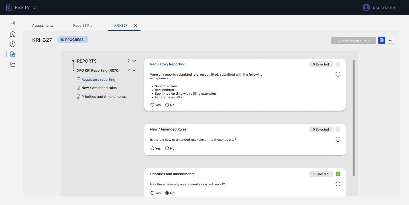
Clear assessment context: The header, tabs, assessment ID and "In progress" status make it obvious which KRI cycle the user is working on, reducing the risk of updating the wrong period or dataset.
Scoped reports in view: The "Reports in scope" panel on the left keeps the active set of reports visible and filterable, so users always know exactly what is included in this assessment without juggling external lists.
Structured KRI check cards: Key questions (e.g. regulatory submissions, new/amended rules) are presented as consistent cards with clear Yes/No patterns, turning a long flat form into a guided flow that's easier to complete and review.
Controlled submission & auditability: A single, prominent "Submit assessment" action finalises responses for that cycle, ensuring changes are captured in one place and can be evidenced for audit instead of spread across emails and spreadsheets.
We were asked to turn a fragile monthly KRI survey process into a governed assessment experience.
The bank's Reporting Oversight team coordinated monthly KRI surveys across hundreds of regulatory reports using Excel workbooks and manual email follow-ups. Survey questions, routing lists and responses were spread across multiple files with no single source of truth. I led the design of a KRI assessment module within the existing risk portal so that survey definitions, assignments and submissions could be maintained centrally, completed efficiently, and defended confidently in front of auditors and regulators.
Fragmented survey definition: Survey questions and allowed responses lived in large Excel workbooks. Updating wording, logic or mandatory fields meant editing multiple sheets and redistributing files, introducing errors and version risk.
No single source of truth for contacts: KRI invitations relied on manually maintained "golden source" contact lists in Excel. Aligning respondents, divisions and report owners across cycles was slow, error-prone and dependent on a few individuals.
Inefficient exception handling: Exceptions (late submissions, penalties, resubmissions) were captured inconsistently via free-text emails and unstructured cells. Identifying which reports had issues, and why, was painful for both oversight and control teams.
No scalable way to handle volume: When an assessment covered 100+ reports, reviewers had to touch every line, even when only one or two had issues. There was no way to quickly confirm "all clear" submissions while capturing detailed information only where there were exceptions.
Understanding the Reporting Oversight lead
Before designing screens, I modelled the needs of the Reporting Oversight role responsible for orchestrating the monthly KRI cycle. This persona highlighted goals (timely, accurate submissions), responsibilities (configuring surveys, chasing responses, managing issues), tools in use (Excel, email, Power Apps), and frustrations (manual follow-ups, no audit trail, duplicated contact management). This artefact aligned risk, product and engineering stakeholders on who we were really designing for.
- Timely, accurate completion of all in-scope KRI assessments.
- Single, trusted view of status, owners, and issues.
- Ability to evidence controls quickly for audit/regulators.
- Configure and launch monthly KRI surveys.
- Coordinate report owners and delegates across regions.
- Monitor submissions, chase gaps, review exceptions.
- Governed place to manage questions and rules.
- Clear overview of assessments and their states.
- Structured capture of exceptions and remediation.
- Heavy reliance on Excel and email chases.
- Manual, duplicated "golden source" contact lists.
- Hard to aggregate and explain exceptions at scale.
The legacy approach: offline surveys and brittle configuration
The existing solution combined a static portal view with offline configuration. KRI questions and answer rules were stored in complex Excel workbooks; administrators manually interpreted them when creating surveys. Regional details and respondent mappings were hard-coded or updated by developers. As the volume of reports and respondents grew, this model became unsustainable and risky.
Survey logic locked in spreadsheets: No direct link to the live experience.
Critical rules expressed in comments: Instead of enforceable configuration.
From spreadsheet rules to self-service assessment configuration
I designed an "Assessment Configuration" workspace where authorised users can define KRI questions directly in the portal, instead of in offline workbooks. Each row represents a question with its owner, grouping, tooltip, mandatory flag, dependencies and applicable report types. A lightweight edit pattern (right-hand side panel) lets administrators adjust questions without leaving the list context. This mirrors familiar spreadsheet workflows while ensuring every configuration change is captured, permissioned and instantly reflected in future assessments.
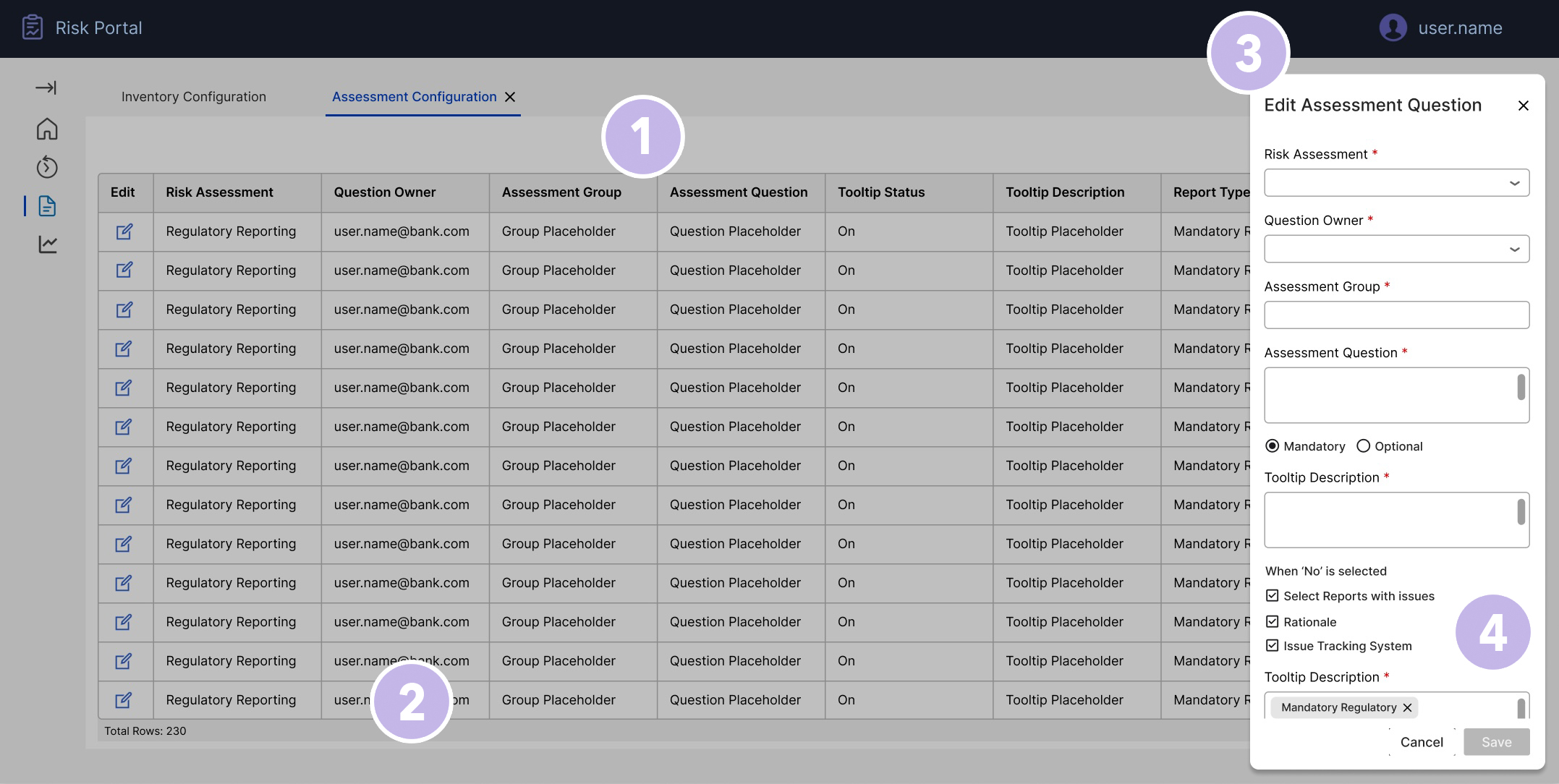
Centralised assessment library: The main grid acts as a single source of truth for all assessment questions (230 rows at the time of this screen), with no scattered Excel tabs.
Ownership and visibility per question: Columns for Risk Assessment, Question Owner and Group make accountability explicit and make it easy to filter who owns what.
In-context editing drawer: Selecting "Edit" opens a side panel beside the table, so admins can update a question without losing their place or context.
Rules as configuration, not comments: Fields like Mandatory/Optional, tooltip, and "When 'No' is selected…" turn business logic into structured data the system can enforce downstream.
Designing the data relationships, not just the screens
The configuration workspace is the visible layer of a more structural piece of design work. Before the screens existed, I worked through what had to exist as governed, related data for the system to behave safely: questions belong to groups; groups apply to report types; report types map to reports, each carrying its control ID, division and country; reports have owners and respondents; and questions can depend on other questions through conditional logic such as "When 'No' is selected". Exceptions are their own typed records, linked to specific reports, with category, root cause and remediation owner.
Mapping these relationships with the product owner and engineering changed the design conversation. A question is not a row of text: it is an entity referenced by live and future assessments. Editing its logic, mandatory flag or report-type mapping is never a local change, so the interface had to surface the downstream impact of a change before it was committed, not after it had broken an open cycle.
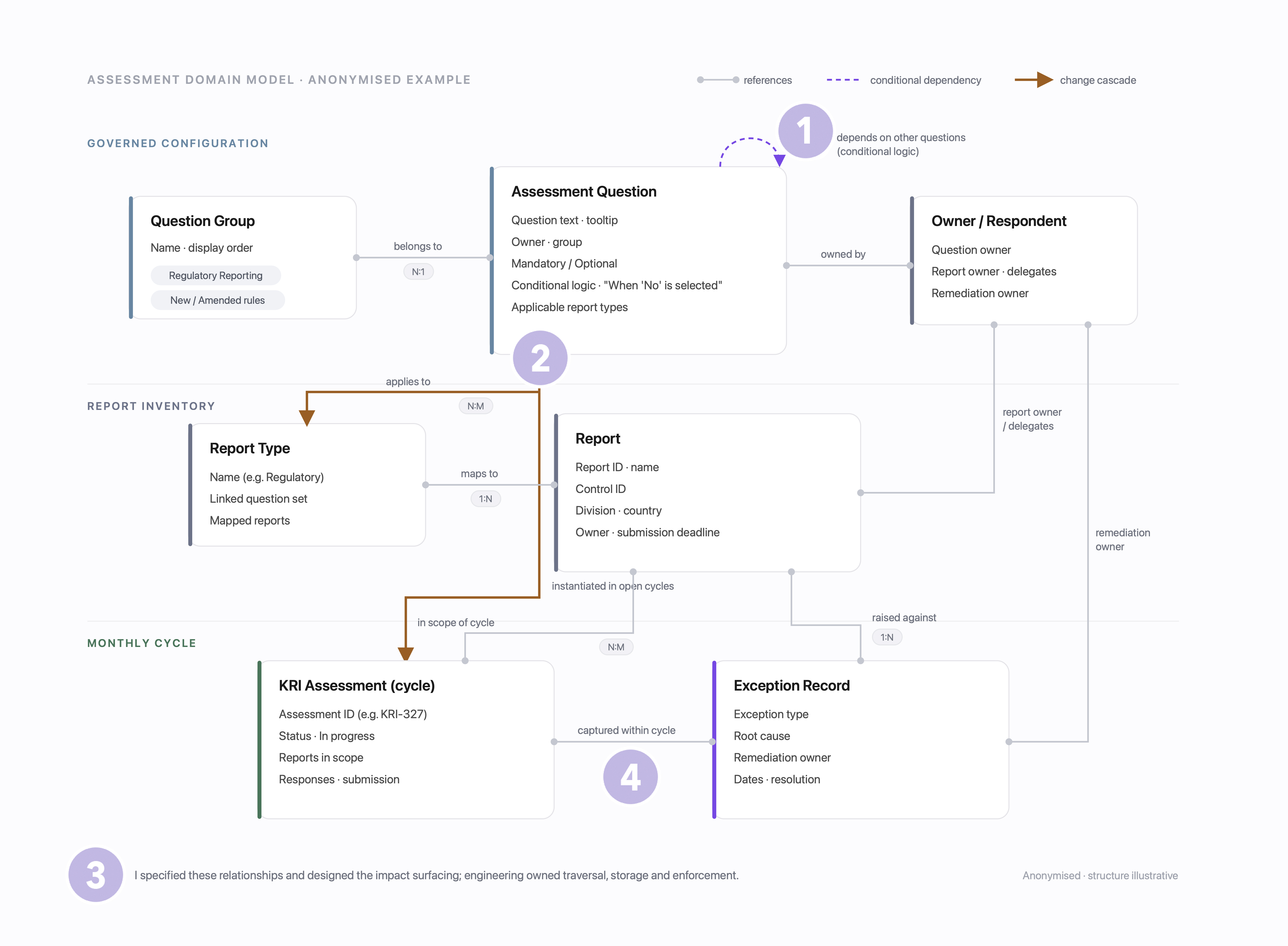
Dependencies as first-class data: Conditional logic is captured as structured relationships between questions, not free-text instructions in a workbook, so the system can route, validate and enforce it downstream.
Impact before commit: When an administrator edits a question, the design surfaces what the change touches (which report types, divisions and open assessment cycles reference it) and asks for explicit confirmation before the change lands.
A clear designer/engineer boundary: I specified which relationships had to exist and designed how impact surfaced to the person making the change. Engineering owned the traversal, storage and enforcement behind it.
Screens stay simple because the model is right: Most of the visible simplicity (positive-by-default, scoped reports, structured exceptions) is only possible because the underlying relationships make those states unambiguous.
Designing an overview and workspace that scale with the KRI cycle
To support continual monthly cycles and growing volumes, I introduced a two-level structure: an overview of all KRI assessments, and a focused workspace for completing each one.
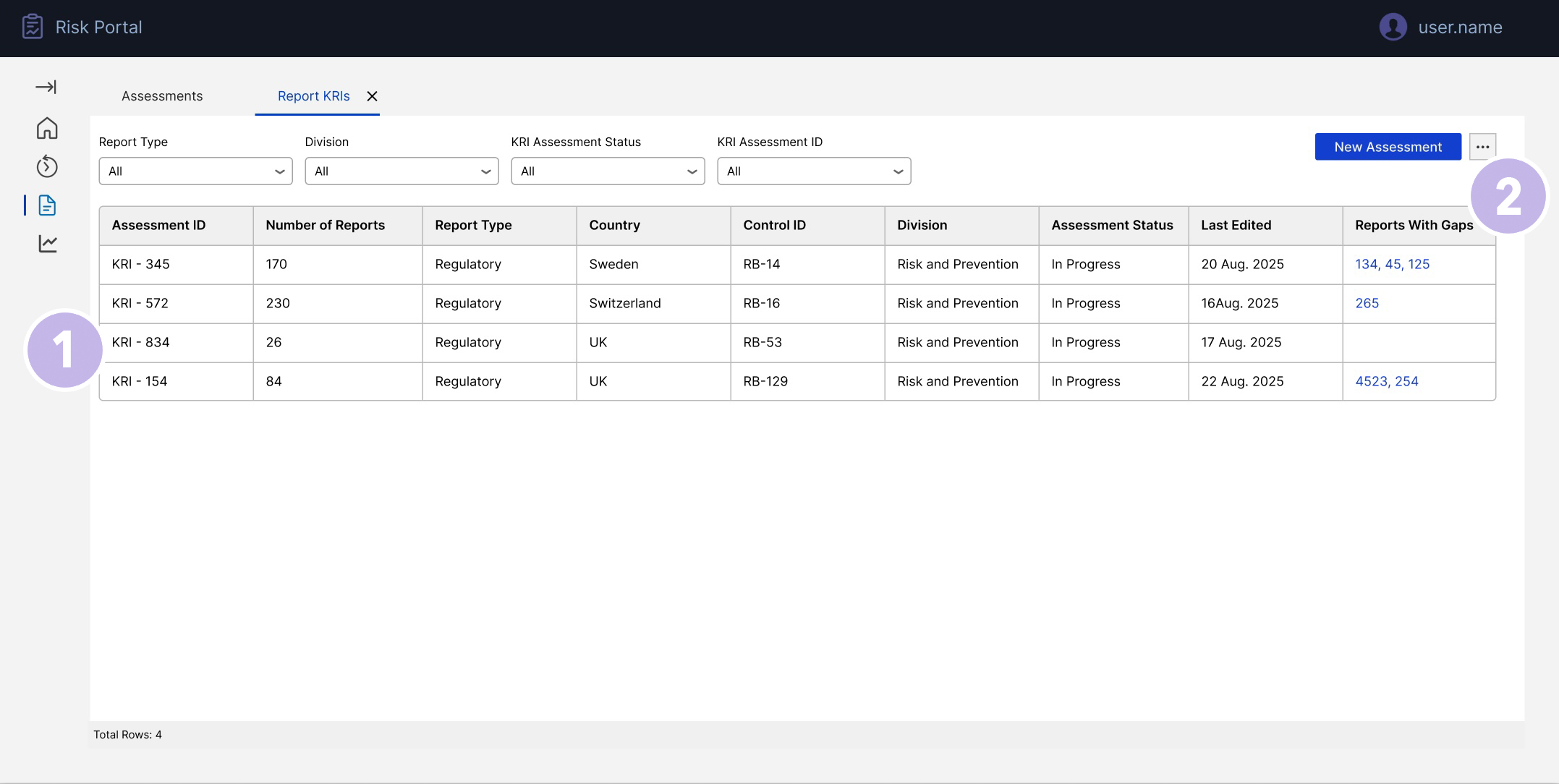
Portfolio view for the KRI function: Single overview of all KRI assessments with filters for type, division and status, replacing multiple tracking sheets.
Immediate visibility of risk & effort: Columns highlight where gaps or issues exist so oversight can prioritise reviews instead of scanning every assessment manually.
At the top level, the KRI Assessments Overview gives Reporting Oversight and Inventory Owners a single view of every active and historical assessment. Filters for report type, division and status, combined with sortable columns, make it easy to see where attention is needed. Each row surfaces key signals such as number of reports in scope and whether any gaps or issues have been identified. From this list, users can either start a New KRI Assessment or select an existing Assessment ID to open the detailed workspace. This keeps navigation simple: one command centre, many assessments, no hunting through spreadsheets or deep navigation trees.
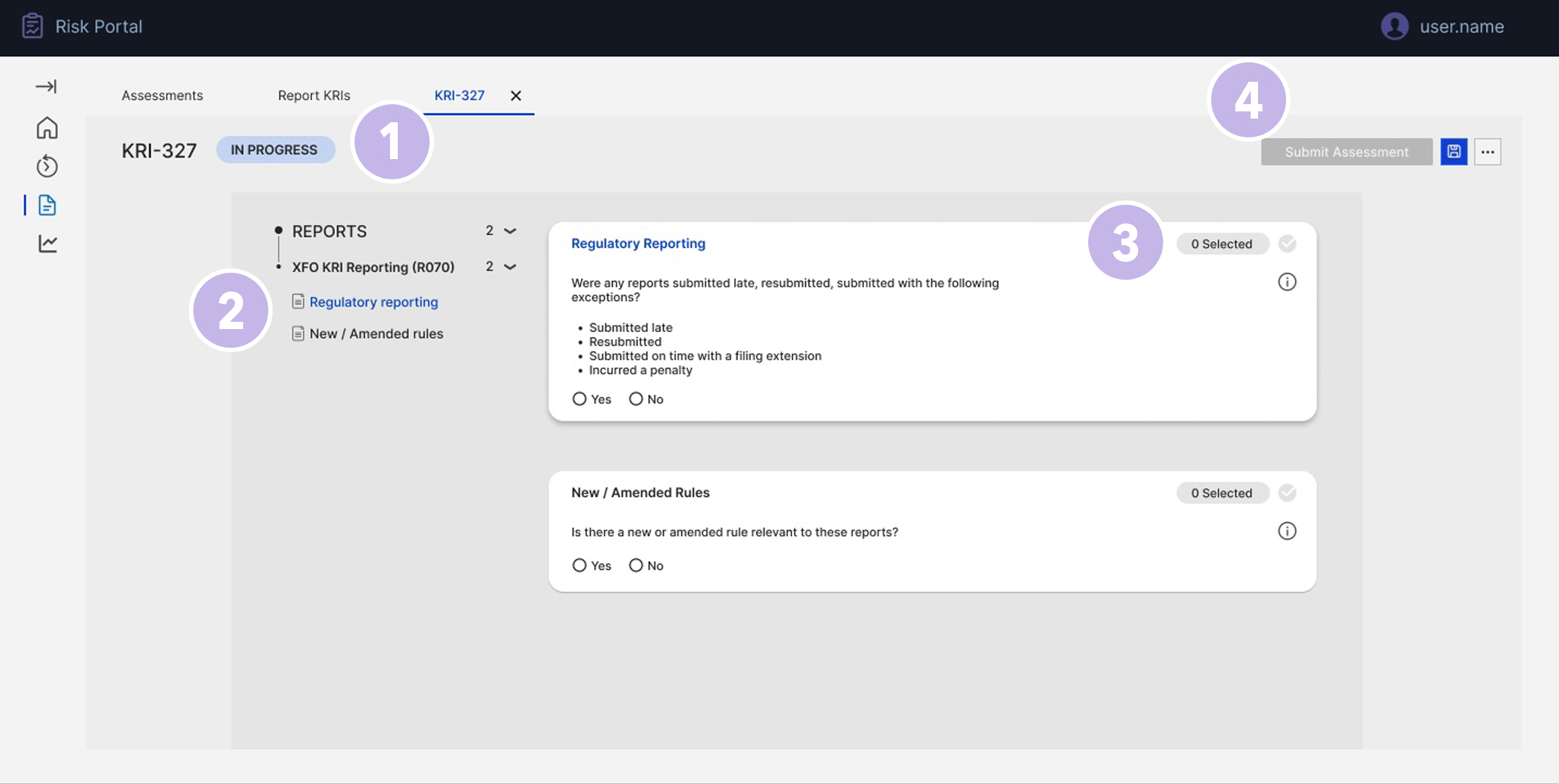
Clear assessment context: The KRI-327 label, active tab, and "In progress" status at the top make it obvious which assessment the user is working on, reducing the risk of updating the wrong cycle.
Scoped reports in view: The Reports panel on the left shows exactly which report sets are in scope (e.g. Regulatory reporting, New/Amended rules), so users don't need external lists to know what they're attesting for.
Guided assessment cards: Each check is presented as a focused card with clear wording and Yes/No controls, turning a long form into a readable, consistent assessment flow.
Controlled submission: A single Submit assessment action in the header finalises responses for that KRI, ensuring everything is captured in one governed place for audit.
The KRI Assessment workspace then provides the structured environment for that specific assessment. Users see the relevant reports in scope and complete the configured questions through consistent card-based patterns. This flow ensures that:
- every assessment is created from governed configuration (no one-off forms),
- roles and permissions are visible,
- and the entire process (from configuration to submission) is captured in a single, auditable experience.
Exception-first design for large volumes
A key requirement was to support scenarios where a reviewer is responsible for more than 100 reports, but only a handful have issues. The previous process forced them to open or confirm each line individually.
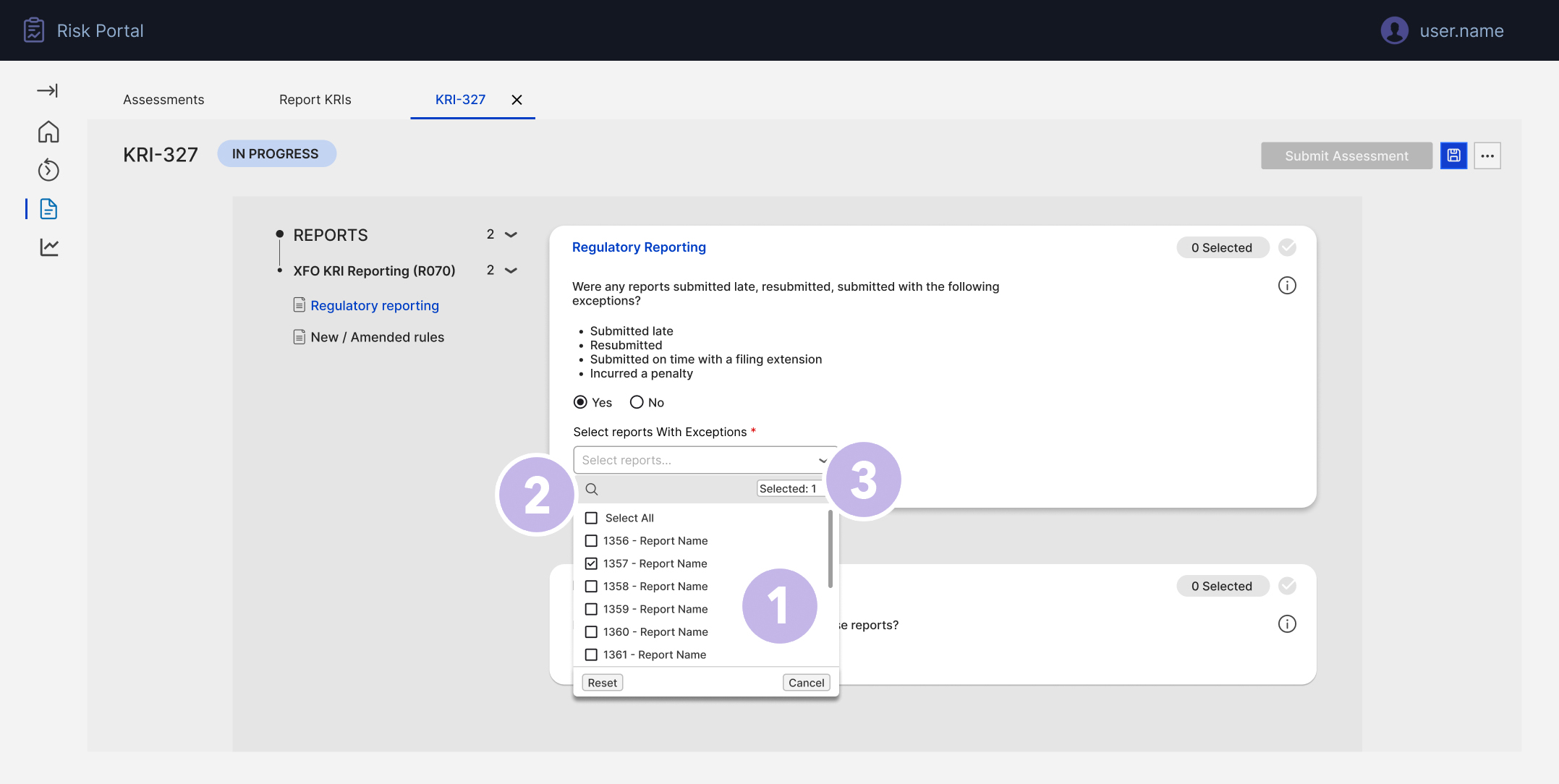
Scale-friendly list: A searchable, scrollable list with checkboxes allows users to quickly pick exceptions from hundreds of reports.
Select-all with control: The "Select all" option speeds up bulk scenarios while still allowing users to adjust individual rows, balancing efficiency and accuracy.
Clear selection feedback: The "Selected X" indicator and chosen chips confirm exactly which reports are flagged before the user moves on.
Direct handoff to details: Once reports are selected, only those items generate detail panels in the next step, keeping the flow tight and avoiding noise for clean submissions.
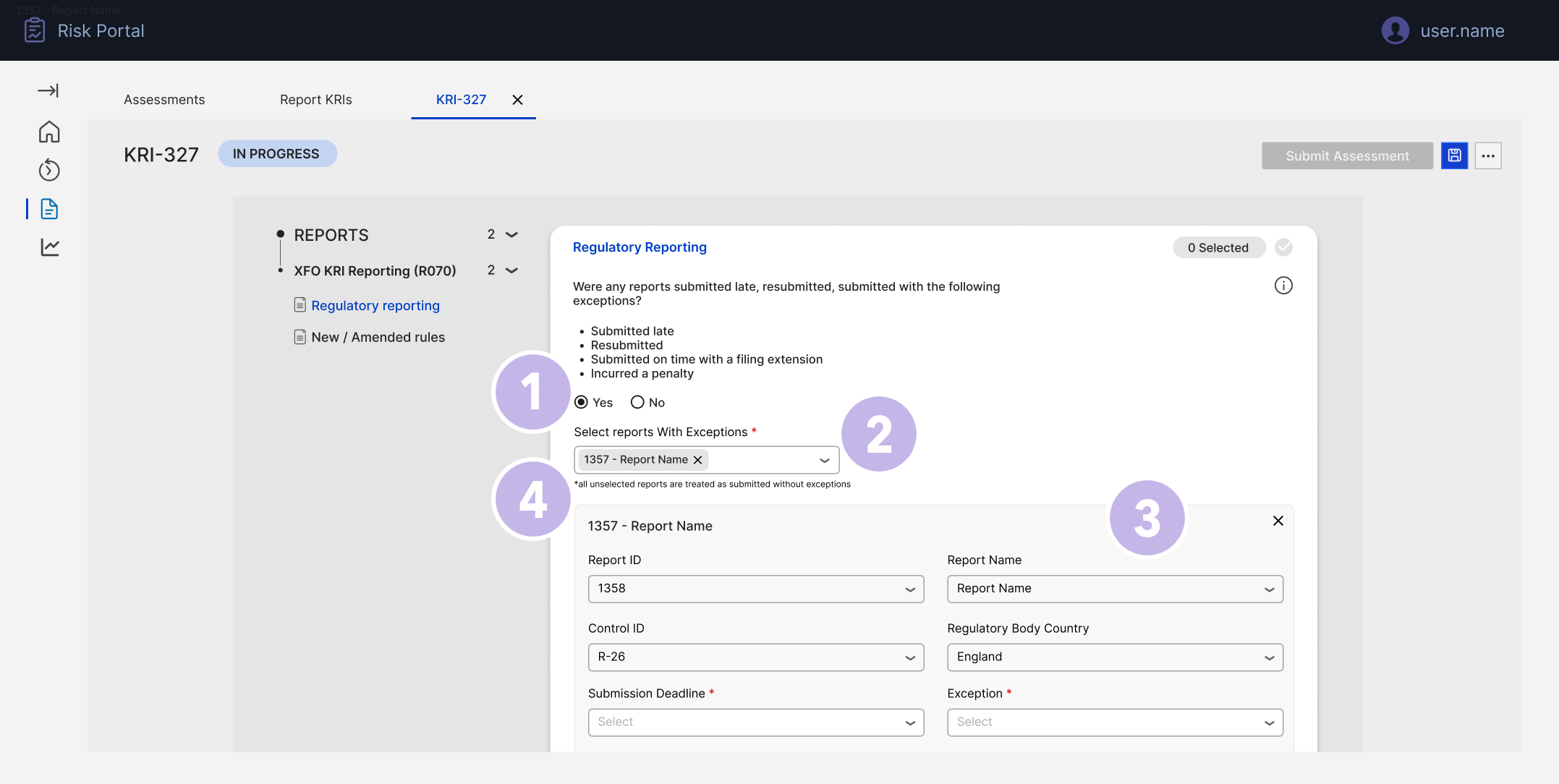
Explicit exception path: Only when "Yes" is selected do we reveal the exception controls, keeping the default "all good" path simple for most users.
Targeted report selection: The "Select reports with exceptions" multi-select lets users mark only impacted reports, instead of touching every report in scope.
Structured exception details: For each selected report, a focused panel captures ID, dates, country and exception type as structured fields, making issues traceable and comparable.
Positive-by-default clarity: Helper text (or label copy) makes it clear that all unselected reports are treated as submitted without exceptions, drastically reducing clicks while avoiding ambiguity.
I designed an exception-first pattern:
- The user is asked whether there were any reports submitted with exceptions (late, resubmitted, penalties, etc.).
- If they select "Yes", a searchable multi-select dropdown lists all reports in scope. The reviewer only selects those with exceptions.
- As they confirm exceptions, the interface clearly states that all unselected reports in this set will be treated as "submitted without exceptions".
- For each selected report, an inline or side-panel form captures the required details (exception type, root cause, remediation owner), ensuring consistent data.
This design means reviewers touch only the minority of problematic reports, while the system safely assumes positive submissions for the rest, with a transparent rule and complete audit trail.
Decisions and trade-offs
Three calls shaped the design more than any individual screen.
Positive-by-default over line-by-line attestation: Forcing reviewers to confirm every report individually felt safer to stakeholders but did not scale and bred rubber-stamping. I argued for the inverse: declare exceptions explicitly, treat the rest as clean under a transparent, on-screen rule, and let the audit trail record that rule. Efficiency without losing defensibility.
Side-panel editing over inline grid editing: Editing directly in the grid would have mimicked Excel, the exact behaviour we were retiring, and made accidental changes to governed data too easy. The side panel keeps list context, fits the full set of fields and dependencies, and makes every edit a deliberate act.
One command centre over per-division dashboards: Division-specific views were requested early, but would have fragmented the single source of truth the project existed to create. One overview with filters for type, division and status gives each group its slice without splitting the data.
Mirror the spreadsheet, don't fight it: The configuration grid deliberately keeps the mental model administrators already had (rows, columns, familiar scanning) while moving the dangerous parts (logic, permissions, versioning) into governed structure. Adoption beats novelty in a monthly regulatory cycle.
Testing with the people who run the cycle
I validated the design with the people who would live in it: moderated walkthroughs with five Reporting Oversight and control users, run over two rounds, followed by a pilot on one monthly cycle running in parallel with the legacy process. Three findings changed the design directly.
The silent majority problem: Reviewers hesitated at the exception multi-select because it was not obvious what happened to the reports they did not pick. The explicit "all unselected reports are treated as submitted without exceptions" rule copy came directly out of this round.
Excel habits die hard: Administrators clicked into grid cells expecting to type, as they would in a workbook. We made the per-row Edit affordance explicit and kept all changes inside the side panel, so governed fields could not be altered by accident.
Selection confidence: Users wanted proof of what they had flagged before moving on. The "Selected X" counter and removable chips were added so the state of a bulk action is always visible and reversible.
Fewer chases, cleaner data: In the pilot cycle, chase emails dropped to under half of the previous cycle's volume, and exceptions arrived as structured records instead of free text, removing the manual reconciliation step entirely.
Reflection
This work reinforced the importance of treating configuration, workflows and evidence as part of the same experience in regulated environments. The design work that mattered most was structural: deciding what had to exist as governed, related data (questions, dependencies, report types, exceptions) so that the screens above it could stay simple. By moving KRI surveys from offline artefacts into governed UI patterns, we reduced operational risk and made life easier for the people accountable for monthly reporting. For me, it was also a chance to blend product thinking (requirements, roles, rules) with hands-on interface design and close collaboration with engineering: exactly the mode of working I bring into consulting engagements.